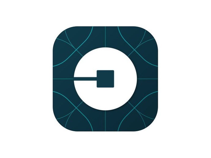
| News  RSS RSS 03 Feb 2016 11:30:25 Source In the new application icon Uber users saw buttocks (video)Uber, the Company has redesigned its logo, corporate identity and icons, mobile apps, reports The Verge. It took several months for the selection of authentic colours for different countries where the company operates. But not everyone was happy update: some users and the media do not understand value of the new icons Uber and took her on the buttocks. Read more... Uber, the Company has redesigned its logo, corporate identity and icons, mobile apps, reports The Verge. It took several months for the selection of authentic colours for different countries where the company operates. But not everyone was happy update: some users and the media do not understand value of the new icons Uber and took her on the buttocks. first, it is worth noting that the company moved away from a strict black and white palette in his trademark style. Apparently, owning offices around the world Uber has decided to imitate the traditions and mentality of different countries, to become closer not only users, but also drivers, authorities, competitors, which periodically have service problems arise.
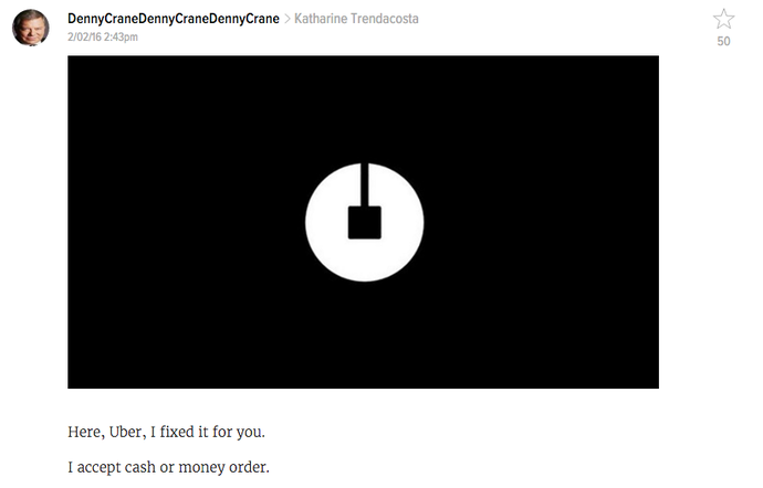
secondly, the new icon needs to represent the client to the final point on his trip. However, not all the analogy was clear. Some have seen in her ancient smile with the "fifth point". It is reversed by 90 degrees. Previously, as the app icons used stylized letter U. See also: the
Other news in this section
| Categories
|


© 2024 b4by.org